challenges/solutions
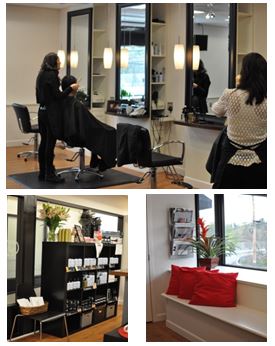 Challenge: the owners of Salon Method in Ruxton took over space previously occupied by an older salon but the décor was more suited to the clientele of the former tenant than that envisioned by the new owners. Challenges included selecting the materials and lighting that best fit the style of the new owners and designing enough seating area for waiting clients without giving up valuable salon workspace.
Solution: bluehouse architecture developed a modern design that capitalized on previously unused spaces. Existing window wells that had been cluttered catch-all spaces in the prior business were turned into built-in window seats for waiting clients. New custom-fabricated shampoo stations and work areas were designed to be both functional and to complement the new owners’ aesthetic vision. Finally, the new color palette of black, greys, and off-white, with red accents, create a sophisticated backdrop for the space.
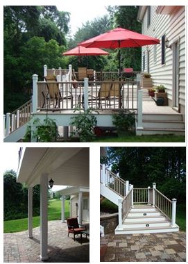 Challenge: the owners of this house had lovely views to the woods from their backyard, but without a deck, had no way to enjoy them. A rolling back yard and unconnected rear access points made the design challenging.
Solution: bluehouse architecture designed a multi-use two-tier deck, covered patio, and new rear porch with spaces to grill, dine al fresco, lounge in the sun, and relax in the shade. A fire pit, hot tub, and ample seating room add functionality. The new deck structure, coupled with a waterproofing gutter system, keeps the lower patio dry, while pavers and vinyl-wrapped columns with built-in lighting create a rustic indoor/outdoor feel within the patio.
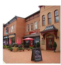 Challenge: the lot beside Town Hall in Mount Airy sat vacant for many years before a mixed-use building was planned. Shortly before construction, a devastating fire destroyed an adjacent building. The design had to be revised and enlarged to include the replacement of the lost building.
Solution: bluehouse architecture created an updated design that includes a front plaza for gathering, café seating, and community events. The scale and details on the elevations were carefully designed to blend with the existing Main Street architecture and has been warmly embraced by the community as it recovered from the destructive fire.
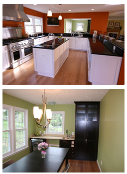 Challenge: the existing kitchen in this residence was small, outdated, and ill-suited to the active life of a family with young children.
Solution: bluehouse architecture designed an addition that features a separate kitchen and dining area. The new kitchen includes a new center prep island, raised counter peninsula with seating, and large pantry. The new dining area is connected through a pass-through that helps to keep everything within reach while maintaining the distinct nature of the two rooms. The open layout, expansive new windows, and additional design amenities, such as a wet bar with a sink and a beverage refrigerator, allow the family to take advantage of the spacious addition and views of the backyard.
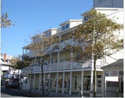 Challenge: the property’s location in the busy downtown district required a harmonious façade that blended with the Ocean City Development Corporation’s vision for the area.
Solution: bluehouse architecture designed a three-story, mixed-use building with retail units on the first floor and two-story townhouse units on the second and third floors. A garage unit on the first floor provides much-needed resident parking. The design was commended for its contribution to the town’s revitalization efforts.
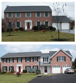 Challenge: The family living in this home had outgrown the basement office space that was used for the owner’s growing business. To provide more space in the home, the owners decided to build an addition that included a larger office space, an accessible laundry room, a second entrance to the kitchen, and more garage and storage space.
Solution: This project required removing the existing two-car garage but the resulting addition, designed by bluehouse, now includes a larger two-car garage, a new entry/mudroom space with laundry area, and a home organization station under the staircase that leads to the new office upstairs. The new office space includes a large open office area, a private office, a coffee bar, and a full bathroom. Off the open office space, bluehouse added a new balcony with a shed below that accommodates outdoor work and yard storage.
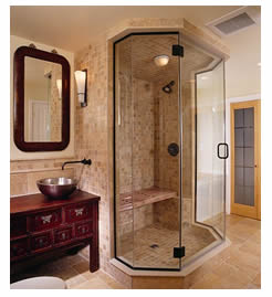 Challenge: The owners of this downtown Frederick row house needed a new master suite that was as well-appointed and comfortable as the rest of their beautiful home. The existing third floor contained a small bedroom, an outdated and boring bathroom lacking in storage, and a nondescript area lacking a true function.
Solution: bluehouse’s design resulted in an elegant and spacious new master bathroom, complete with a double steam shower, and an antique vanity with vessel sink. A new walk-in closet with a dressing area adjacent to the new master bathroom and new master bedroom with a sitting area at its entry completed this award-winning design.
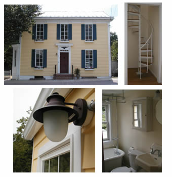 Challenge: Years of neglect and previous additions had resulted in a house with an odd, compartmentalized configuration and a lackluster style.
Solution: bluehouse architecture designed a completely revised layout that accommodates a single-family residence and a rental apartment. The design work in the main house included refinishing hardwood floors, redesigning a new and enlarged kitchen, designating formal dining and living spaces and a new family room, updating two bathrooms and three bedrooms, and creating a fourth bedroom. bluehouse designed even more dramatic changes in the apartment, including a new first-floor entry, a new kitchen, a full bathroom, and new living space. A new spiral staircase provides access to the former attic area, which now houses a stylish loft-style bedroom. Other renovations included new landscaping, removing an old exterior wooded staircase, restoring the wood siding beneath existing aluminum siding, repairing windows, and adding window boxes and a new front white picket fence to create a charming and completely updated residence and rental unit.
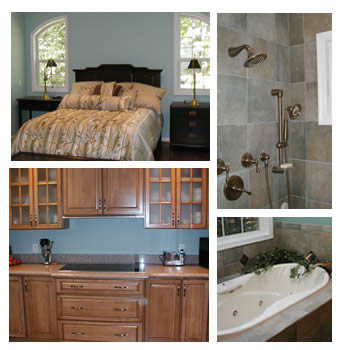 Challenge: After undergoing knee surgery that required rehabilitation and recuperation, the owner of this suburban home wanted to upgrade the house while considering possible aging-in-place design options. The existing master bedroom and bathroom were located on the upper level of this two-story home and reflected an older, outdated design.
Solution: bluehouse architecture designed an addition that allows one-level living and includes a new master bedroom, bathroom, and walk-in closets. This new master suite, accessible from the existing living room, includes the bedroom, two walk-in closets, and a master bathroom complete with an oversized shower without a threshold (which is a potential hazard for older homeowners), open storage and display shelves, a soaking tub with a window that overlooks the wooded backyard, a toilet nook, and dual vanities. One vanity has open knee-space at the fixture for wheelchair accessibility. The shower includes grab bars designed to look like towel bars and blocking in the toilet nook can accommodate grab bars if they become necessary in the future. A skylight over the soaking tub, and windows installed at the top of the walls, provide a bright and open feel while maintaining privacy.
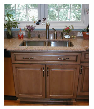 Challenge: The owner of this suburban home wanted an upgraded layout that would include aging-in-place design options. The first floor of the existing home contained compartmentalized rooms and a cramped and dark kitchen. In addition, a basement laundry room would have been difficult to access as the resident aged.
Solution: bluehouse architecture designed a renovated first floor that added an accessible powder room and linen closet. The basement laundry room was moved to the first floor along with a front-loading washer and dryer, counter space to fold laundry, and cabinets for storage. Removing several interior walls lets in more light and provides an open flow of space in the redesigned and enlarged kitchen. The new kitchen design was designed without a fixed island to accommodate easy access to all the kitchen appliances and work spaces for someone using a walker or wheelchair. In addition, the base cabinets below the cooktop and sink were custom-built so they can be easily removed if wheelchair knee-space is needed in the future. Reorienting the kitchen layout allowed room for additional perimeter cabinets and counters, natural lighting at the sink, and a triple French door at the new table space. The newly designed space emphasizes mobility and accessibility while incorporating openness, light, and elegance.
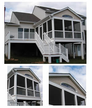 Challenge: The owners of this Mt. Airy home had a large and beautifully landscaped back yard but and wanted an exterior structure that would allow them to enjoy the outdoors and provide an area for entertaining.
Solution: The homeowners wanted a screened-in porch and deck that harmonized with the rest of their home and didn’t look like a typical deck and porch constructed with the unfinished look of pressure-treated wood. bluehouse designed a porch with a feature window, a vinyl-wrapped structure and vinyl railing system, and ipae decking, providing the finished look the owners desired. The new exterior spaces transition smoothly from the home’s interior to the back yard, providing a tranquil and relaxing outdoor oasis that accommodates the owners’ entertainment needs.